A brand old (type) face
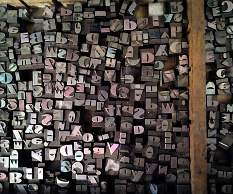
In 2009, when Novepunti started, the first step was to find the equipment: from typefaces to presses we spent a long time looking for them. At the end of the year, after some attempts that went failed, we found an ad on eBay, about an entire small printshop: one foot pedal press, all the tools needed (from rollers to galleys and sticks) and eight cabinets of wood and lead types.
Most of them were quite common, some sort of Helvetica or roman-like. But, in a drawer there was something really interesting!
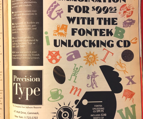
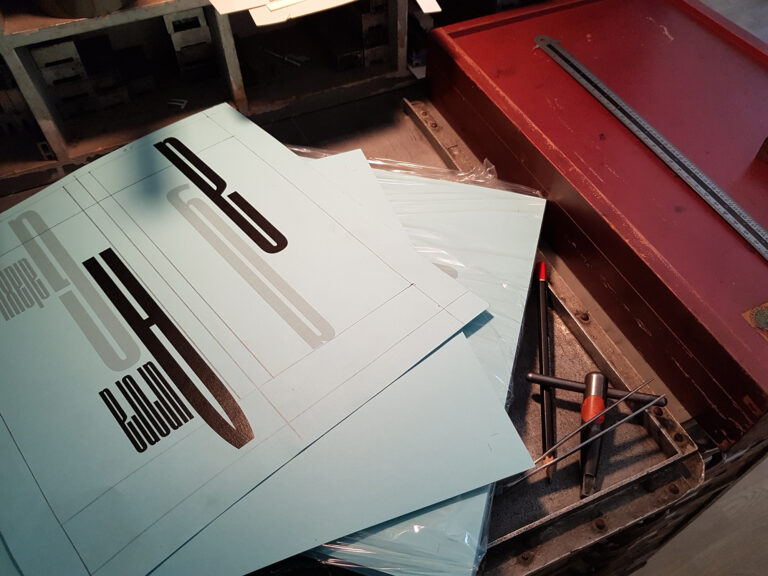
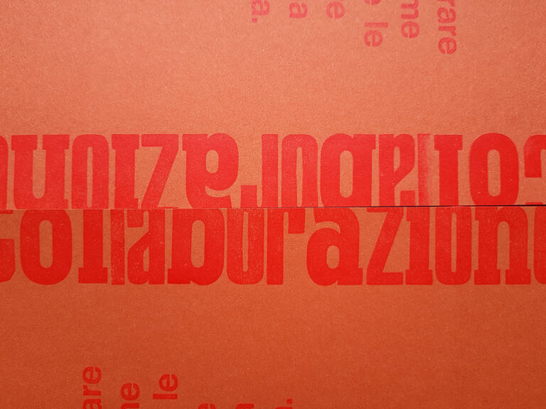
The upper case, divided into two sections, contained a set of Broadway and a set of Neon. In the lower there was – and it is still there, a strange, bold one. At that time, we didn’t know anything about it so we named it “Flintstone”, like the cartoon, for the simple and geometric design. Some years later, checking in internet, we found a digital release called Belmondo with nothing about the designer or the foundry. So I asked to our friend Stéphane de Schrevel: after a long search, he sent me a picture of an old Letraset catalogue. The font was used in an advertising without any info about it. I was a little bit down but Luck was lying in wait! More specifically, on the Instagram profile of Tipoteca: the picture of a german specimen of Ziedolmen, a decorated version of ours. After a quick check on internet I putted all the bricks together: the real name of that fancy typeface is Dolmen, designed by Max Salzmann in 1922 for the Schelter & Giesecke Foundry in Leipzig (Ziedolmen is a sort of upgrade done in 1923). In 1987 Letraset did its own releases and, in 2011, Nick Curtis digitalized both, renamed Salzmann Deco NF and Salzmann Deco Deco NF. A small mystery solved; the other one is why, when and in which way this german fatty typeface arrived in the suburbs of Milan. I suppose it will continue to have no solution.

